Microsoft Edge

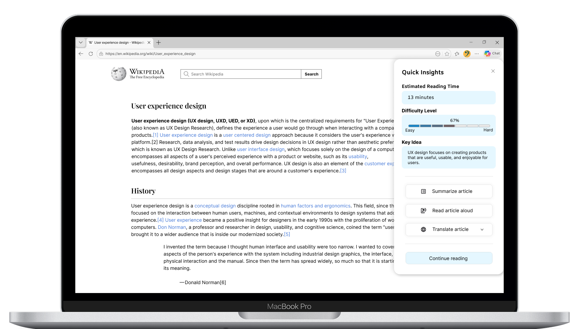
An AI-powered feature for Microsoft Edge that helps users evaluate content before reading by providing estimated reading time, difficulty level, and key ideas at a glance.

Project Overview

I designed Quick Insights, an AI-powered feature for Microsoft Edge, integrated into the existing browsing experience to help users quickly decide whether an article is worth reading before committing time and effort.

Through user interviews with both native English speakers (NES) and English as a second language (ESL), I identified a need for a faster way to evaluate content. This led to a unified in-browser experience that surfaces reading time, difficulty, and key ideas upfront.

By enabling users to quickly match content to their needs, especially for longer articles, the feature supports more efficient content filtering. It is particularly valuable for users who engage in high-volume reading, reduces cognitive load for ESL users, and improves accessibility for users with reading difficulties.

Project Type
Microsoft Edge (Browser Feature)
Duration
4 Weeks (2026)
Scope
User Research, Insight Synthesis, Feature Concept Development, Interaction Design, Usability Testing, and Prototyping
Tools
Figma, FigJam
Role
Solo UX/UI Designer

The Problem

1. Users struggle to decide if an article is worth reading before they start
Both NES and ESL users often waste time opening long articles without knowing how long they will take, how difficult they are, or what they are really about. Without clear pre-reading signals, users feel uncertain, get frustrated, and frequently leave the page or rely on external tools to decide whether to continue reading.
2. ESL users experience high cognitive load when reading long English content
Many ESL users struggle with long English articles due to unfamiliar vocabulary and complex language structures. While Edge offers translation and AI capabilities, these features are not seamlessly integrated into the decision-making stage. As a result, users often rely on external translation and AI-assisted tools, requiring multiple interactions across different contexts. This fragmented workflow disrupts reading flow, increases cognitive load, and leads to a less efficient user experience.
3. Users need hands free and multilingual support to consume content while multitasking
Interviews show that many users, especially ESL users, want to listen to content while doing other tasks, such as commuting or working. Users also benefit from reading summaries and listening in their preferred language, especially those with strained vision, reading fatigue, or accessibility needs. Without integrated summary and read-aloud support, users are less able to consume content flexibly and efficiently within the browser.
There is an opportunity to reduce friction in how users decide, understand, and consume long-form English content by providing clearer previews and integrated multilingual support.

User Research & Key Insights

Target Users
  • Multilingual users / ESL learners
  • Students and knowledge seekers who read long-form content
  • Busy professionals who need to quickly evaluate articles
  • Users with accessibility needs (e.g. reading fatigue, vision strain)
  • Users who prefer audio consumption (e.g. commuting, multitasking)

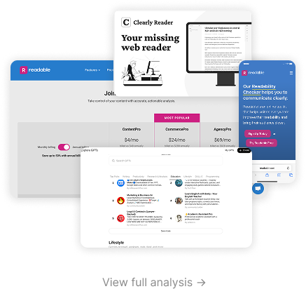
Insights From Competitor Analysis

Reading support features are fragmented across tools, requiring users to switch contexts and disrupting the overall experience.
Existing tools provide limited support for helping users decide whether content is worth reading before committing time.
Current solutions struggle to balance simplicity and depth, forcing users to trade ease of use for meaningful insights.
Accessibility and language support remain insufficient, particularly for ESL users and those with higher cognitive load needs.
Research Methods
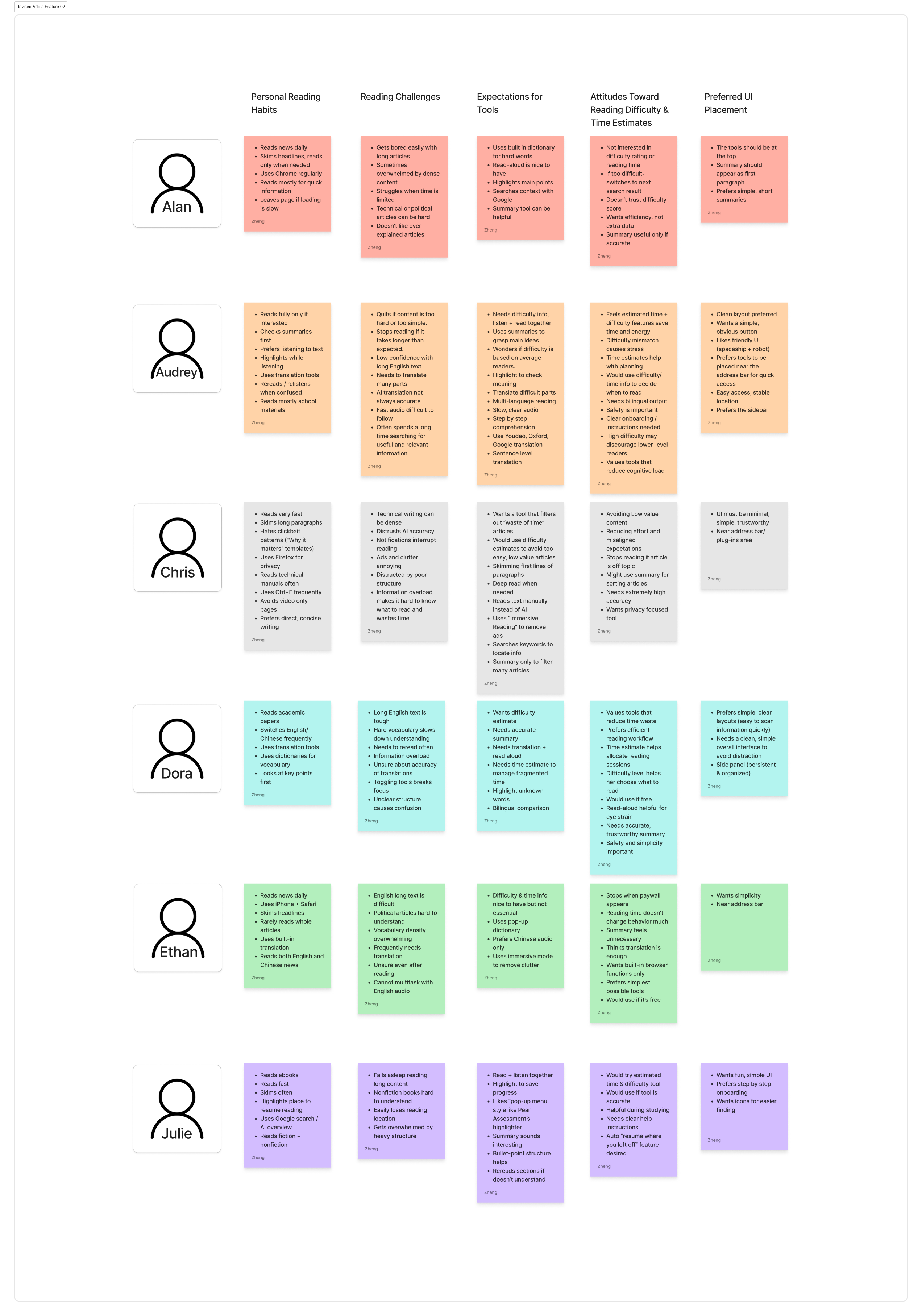
To understand this behavior more deeply, I conducted interviews with both native and non-native English speakers. I focused on how they decide whether to read an article, what causes them to stop, and what tools they currently use. While reading confidence varied, all participants described time as a critical factor in their decision making process.
Key Insights from User Research
Pain Points
  • Users struggle to judge an article’s value before reading.
  • No clear expectations for reading time or difficulty.
  • Difficulty in quickly grasping the main idea without a short summary.
  • Low-quality or repetitive content (ads, filler, AI-generated text) wastes time.
  • Long articles feel overwhelming and lead to early drop-off.
  • ESL users face vocabulary and comprehension challenges.
  • Features must be easy to find, hidden entry points reduce usage.
Key Findings
  • Users want to know how long an article takes, how hard it is, and what it’s about before they start reading.
  • A quick, one glance preview helps users decide faster and save time.
  • Interest still matters most, but previewing info helps users avoid low value articles.
  • ESL users need clarity and language support; NES users want speed and efficiency.
  • Features placed in familiar locations (address bar, sidebar, clear icon) feel easier to trust and use.
  • Users prefer simple, lightweight tools over detailed or complex analysis.
Insights
  • Helping users know what to expect before reading reduces stress and mental effort.
  • Combining time, difficulty, and key ideas in one place is more helpful than separate tools.
  • Clear explanations make users feel more confident and more willing to try a new feature.
  • ESL users especially benefit from simpler summaries and translation support.
  • A feature must be easy to find and quick to use to become part of daily behavior.

Personas

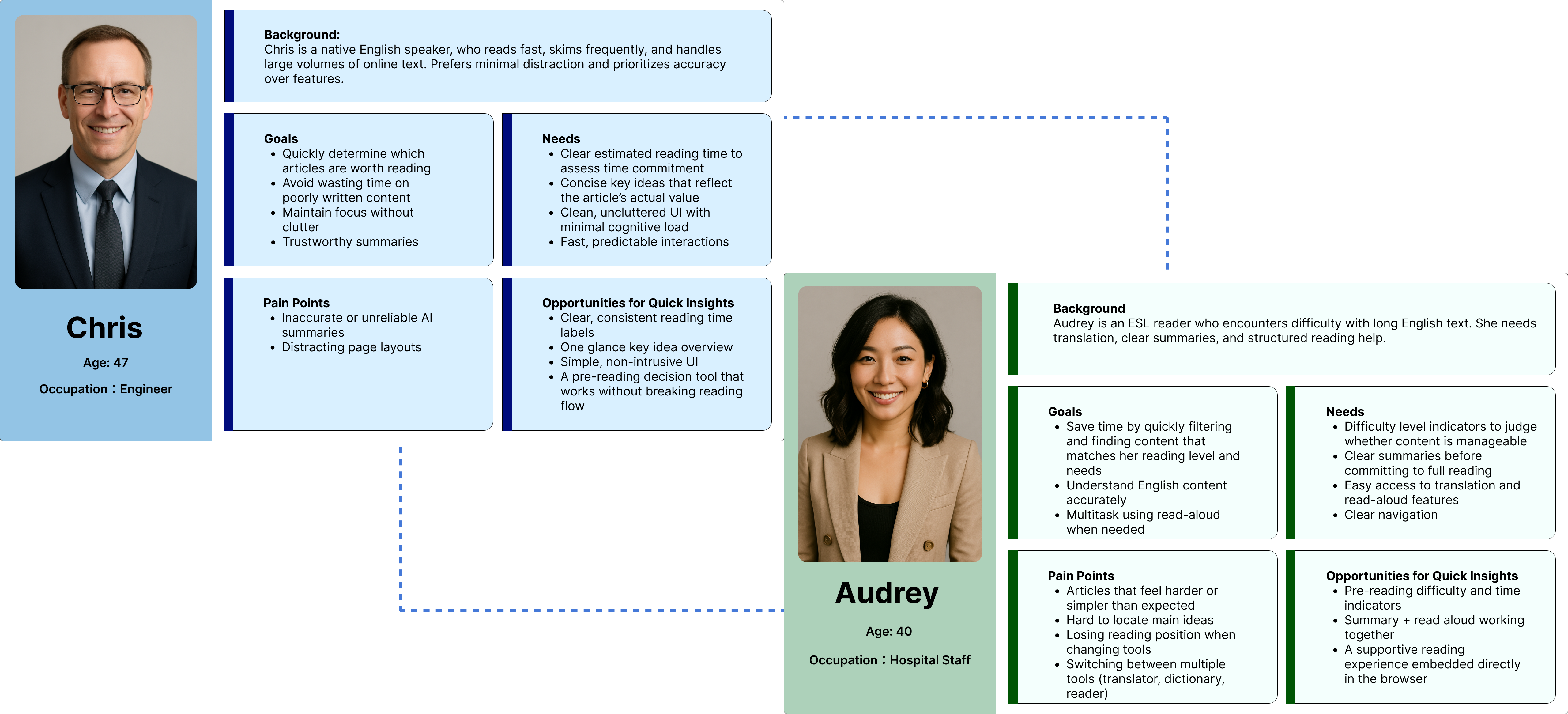
Two primary reader groups emerged: fast, confident readers and readers who need additional language support. However, both groups shared a desire to quickly assess value, avoid wasted time, and maintain focus. This insight challenged my initial assumption that reading aids only benefit non-native speakers.

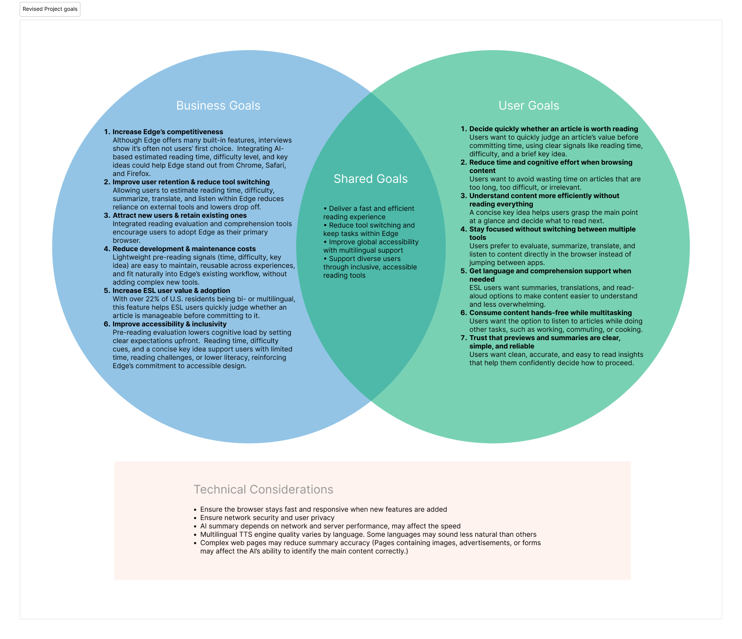
Project Goals

User flows

#1 Discovering and using quick insights

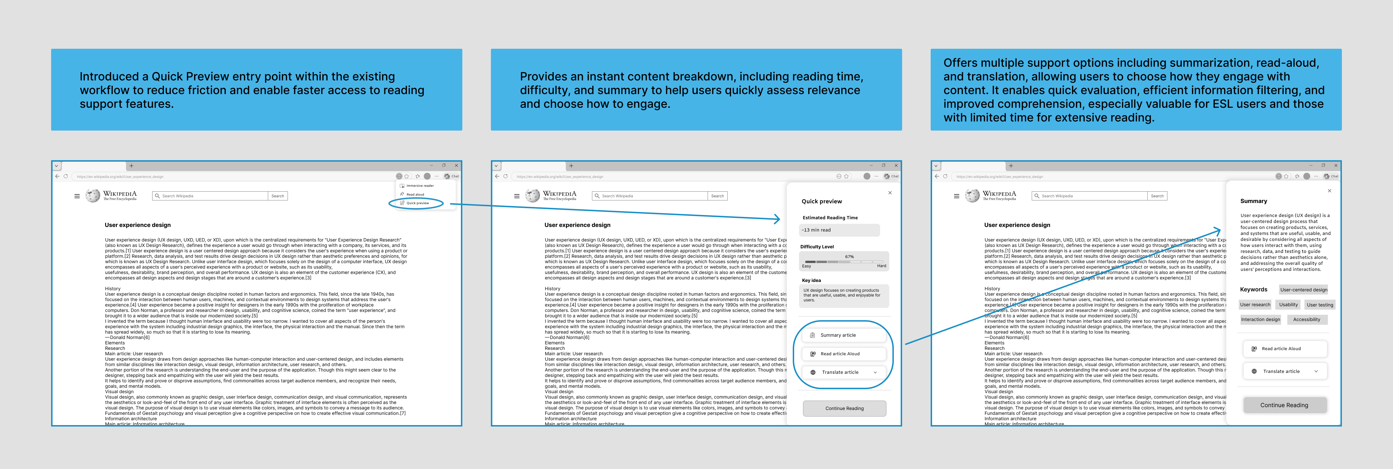
This flow helps users quickly decide whether an article is worth reading before committing time and effort. The user flow was intentionally divided into two stages: a decision stage, where users evaluate content through Quick Insights, and an action stage, where they choose how to continue reading based on their individual needs.
#2 User selects a next reading option

After reviewing Quick Insights, users can choose to summarize the article for better understanding, translate the article into their preferred language for easier understanding, or use read aloud to listen to the content while keeping their eyes and hands free.

Problem Solving Through Design

Usability Testing
What Worked Well
  • Several participants (Alan, Dora) described the interface as clear, clean, and easy to use.
  • Buttons were consistently praised as large and readable.
  • Users strongly agreed that the feature would save time and help them decide what to read more confidently.
Challenges Identified
  • Reading time labels were unclear.
  • Language switching caused friction.
  • Interaction feedback was unclear.
  • Language navigation was not intuitive.
Design Changes
  • Clarified reading time labels to better communicate estimated effort.
  • Improved language switching to reduce friction for ESL users.
  • Standardized highlight styles for visual consistency across languages.
  • Added multilingual summaries to support content understanding.
  • Refined interactions to create a smoother, more natural experience.

Outcomes & What I Learned

This project showed me that good design supports decision making, not just content consumption. Even confident readers benefit from clear signals before reading, and small details like labels and interactions can make a big difference. Working within an existing product ecosystem also challenged me to find the right balance between introducing new ideas and staying consistent with the overall experience.

Reflection & Next Steps

This project reinforced how even lightweight features can meaningfully improve the reading experience when they are thoughtfully integrated into existing workflows. Features like reading time, difficulty indicators, and quick summaries can help users feel more confident and informed before committing to longer content.

It also challenged me to design within an existing product ecosystem instead of creating something completely new from scratch. I learned how important it is to balance new ideas with consistency, making sure the feature feels helpful and integrated naturally into the overall Microsoft Edge experience.

If continuing this project, the next step would be testing the feature with real users to better understand how it impacts reading behavior, engagement, and overall usability. I would also explore opportunities for more personalized reading support, such as customizable insight levels and adaptive content summaries, to create a more flexible and supportive reading experience for different types of users.
Thank you!
Thanks for taking the time to explore this case study!
or
Let’s connect
I'm open to UX/UI opportunities and would love to connect.